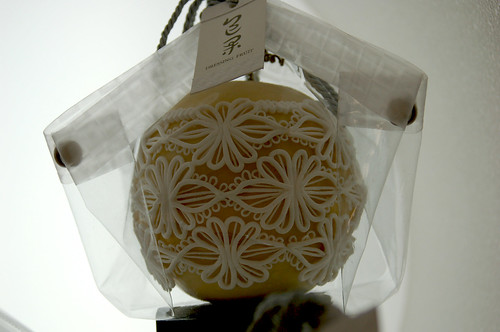
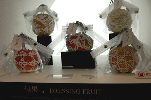
If you’ve ever seen those little green foam protective covers on fruit, then you’d understand this designer’s desire to beautify function. This is one student’s design. Thousands of students participate in YODEX. Around 60 universities from Taiwan and 22 international universities participate in this exhibition occupying two entire exhibition halls at the Taipei World Trade Center adjacent to the landmark Taipei 101 building. I was invited to go by my residency host, Chih Wei, whose alma mater, National Yunlin University of Science and Technology was represented. She explained to me that each student’s work was chosen by jury, and most of the students who were given the opportunity to exhibit were showing what would be considered their thesis work. Some of the work was by non-graduating students, but this is unusual because of the time, resources and funding that goes into it.

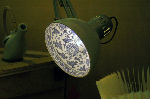 Each University represented a specific department with in their school. By specific, I also mean unique and uber niche; for example, Dayeh University represented their Department of Plastic Art. Other departments included Multimedia and Game Science, Multimedia and Entertainment Science, Digital Content and Animation Design, Techno-Craft Design, Styling and Cosmetology, Technological Product Design, Fashion Imaging; and, of course, Industrial Design, Arts and Design, Visual Communication Design, etc. Within almost every School and Department we toured, we found ceramics! Yea! And, duh. Taiwan has an extremely rich history in that regard, and in the contemporary designs, historical references appeared here and there. Here is Chih Wei standing in front of an elaborate display of various ceramic designs. The light behind her actually looks like Ming Dynasty porcelain inside—a simple, pleasing design idea that actually brings the idea, as opposed to the material, of traditional ceramics into industrial design.
The designers’ products and displays ran the gamut of what can be considered art, design, craft and visual communication in every material imaginable. Some focused on “Green” design, some on the design of new objects, some on packaging design, some on the design of an experience in which objects and images were like supportive props, and some focused on purely conceptual objects. Digital images, animation and computer programming constituted a considerable amount of the exhibition space as well, but since I’m an object maker fascinated by material and its plead for innovation, my attention was swayed by presentations satisfying my interests.

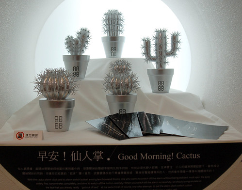
An alarm clock in the form of a potted cactus doesn’t seem all that innovative until it is understood that in order to turn off the alarm, the waking must find the sprig of needles that is the off/snooze button. Not so easy to slip back to sleep after that, eh?

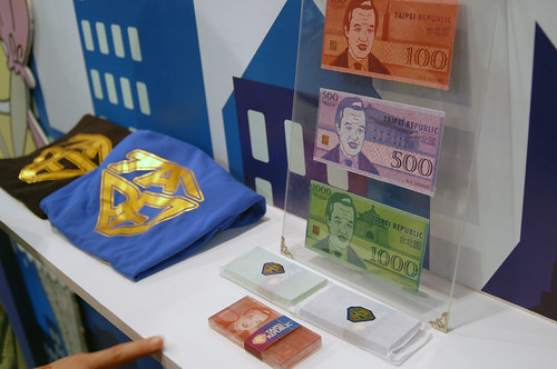 Another popular booth was an entire immigration center for a fictional “Taipei Republic”. Complete with a silly form to fill out and a nonsensical quiz to take before your identification card picture was taken. It was free to receive your I.D. card via e-mail, and a printed souvenir would set you back a nominal sum. I have yet to receive mine, but I haven’t checked the junk mailbox yet. Other souvenirs were for purchase as well such as handmade soap with the image of the President Ma on it, little trading cards and t-shirts reading “Tai-pei” in the shape of . . . what else but . . . the Superman logo. We entered through the “Entrance” gateway looking much like the airport metal detectors, and exited through a similar “Departure” gateway. The whole thing was very entertaining, and politically charged, but Chih Wei and I didn’t discuss the details of how this fabricated republic’s comical immigration experience was viewed in that respect. We were having a good time, and a conversation about politics through translation in the middle of a crowded exhibition hall seemed like it would put a damper on things. There was plenty to be inferred here. Since we both decided to indulge in this designer’s world, I figured nothing too horrible would come of giving out my e-mail address, signing my name and having my picture taken . . . uh . . . well, I guess I can’t take it back now.

Ok, so, design catering to a unique cultural heritage, and political art sometimes need translation, but touring this exhibition was the opposite of wandering aimlessly in a foreign country. That’s the great thing about art and design, they are their own language, and its one I understand. You do or will too, because good design speaks to elements such as humor, beauty, food and metaphor, of our contemporary lives that are simply human.
Look for the “Good Morning Cactus” and “Dressing Fruit” protectors at stores near you soon.
You can view more pictures of our tour of YODEX on my Flickr page.